
Bridge Enterprise Rent-A-Car’s usability gap to enhance user experience
| Documenting Usability Issues Found |
Timeline
January - April 2024
(12 weeks)
My Role
User Research: Heuristic Evaluation, Project Plan, Screener, Usability Testing, Card Sorting, Task Flow
UX Design: Sketches, Low fi- Mid fi Wireframes, High fi Wireframes, Prototypes
Toolkit
Figma
Miro
Adobe Illustrator
C O N T E X TUsability Issues during car reservation and account sign up in Enterprise’s website
Unclear language during the sign-up process causes frustration for new users.
Modifying existing reservation during the car rental process proved difficult.
Difficulty navigating to previous step, requiring re-entry of information and increase in overall time.
Unclear payment details due to cluttered screens.
B A C K S T O R Y + P R O B L E M S T A T E M E N TWhat if Enterprise Rent-A-Car’s website provided a hassle-free experience with easy reservation changes and clear payment details? This could save users time and build trust in the rental process!
Whether it is a frequent user or someone renting a car for the first time, users expect a streamlined car rental process that is easy to understand and transparent at every step. Trust formed during the process is crucial, yet the reservation and payment system of Enterprise’s website is often frustrating and confusing.

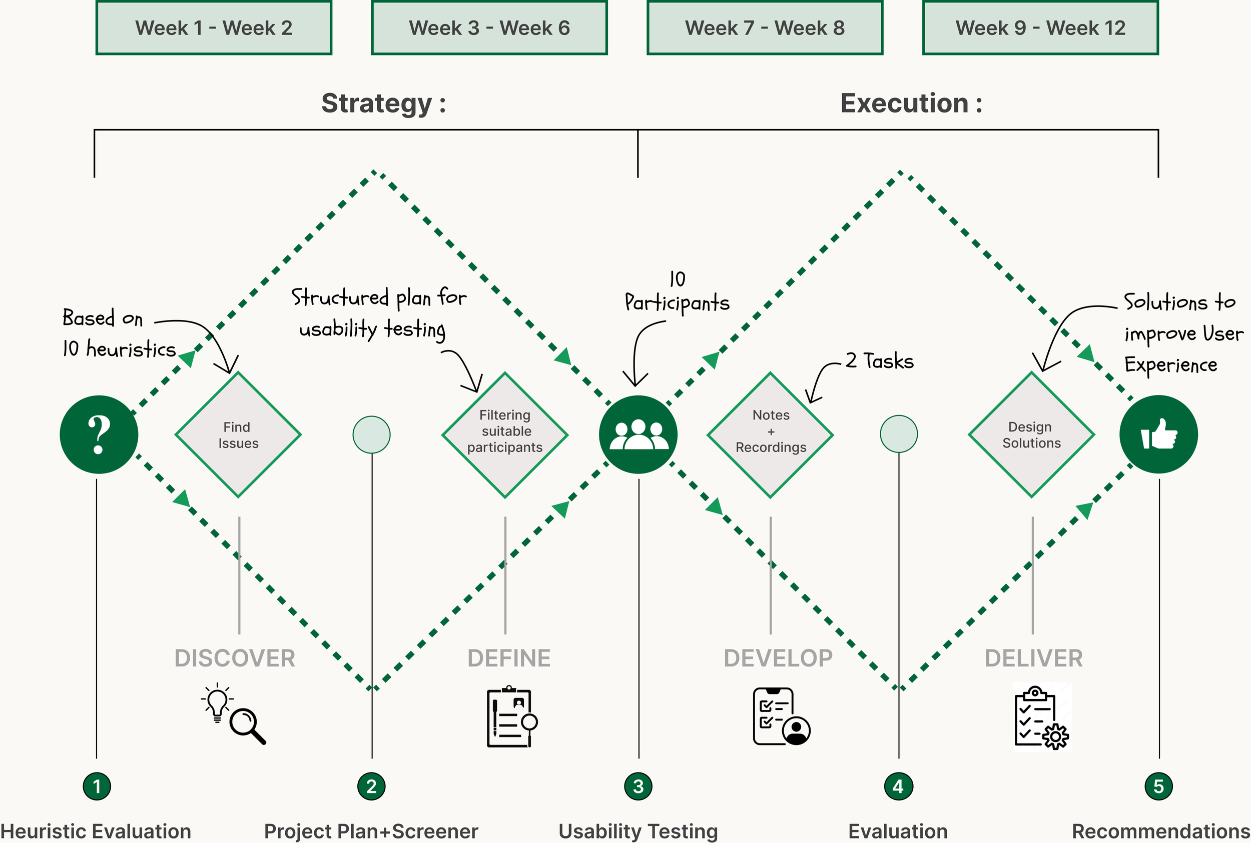
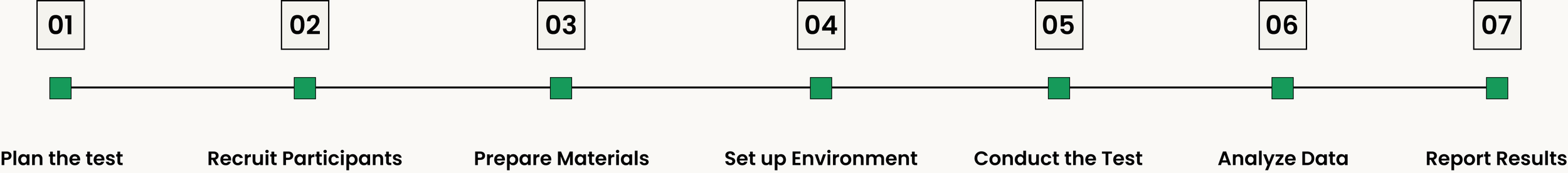
D E S I G N P R O C E S S + T I M E L I N EProject plan to analyze existing usability issues in the website and provide recommendations
The design process began with extensive research through heuristic evaluations, and usability testing to study how people make online car reservations using a car booking website/application. This research helped uncover users’ needs and expectations from Enterprise Rent-A-Car. Based on the insights gained during usability testing sessions, I thoroughly analyzed their pain points and requirements at every step of the task flow. This research helped analyze areas of improvement for the Enterprise website.
C O M P E T I T I V E A N A L Y S I SEach of the competitors had something unique to offer but….
I analyzed the digital booking platforms of all three vehicle rental services and found out that

“We work to meet the needs of the people today without dimnishing the ability of future generations to meet their own needs”

“Revolutionizing the car rental industry by providing a seamless, personalized, & community driven platform for car sharing”
“To be the best transportation service provider in the world”
R E S E A R C H + P R O C E S SA way to increase car reservations by 35%
Starting with the competitive analysis, I began to draw areas of strength, weakness, and USP from each of the car rental competitors. To understand the “why” behind the problem, I divided 12 weeks of research and documentation process into four different stages that include:
1. Heuistic Evaluation
2. Project Plan + Screener
3. Usability Testing
4. Evaluation + Recommendations
I aimed to understand, identify, and evaluate users’ attitudes and feelings towards online car reservation and their current experience using Enterprise websites or other car rental website. Following the usability tests, I analyzed the notes, and categorized them as positive and negative findings and Ah Ha moments in order to develop insights and offer design solutions/recommendations.

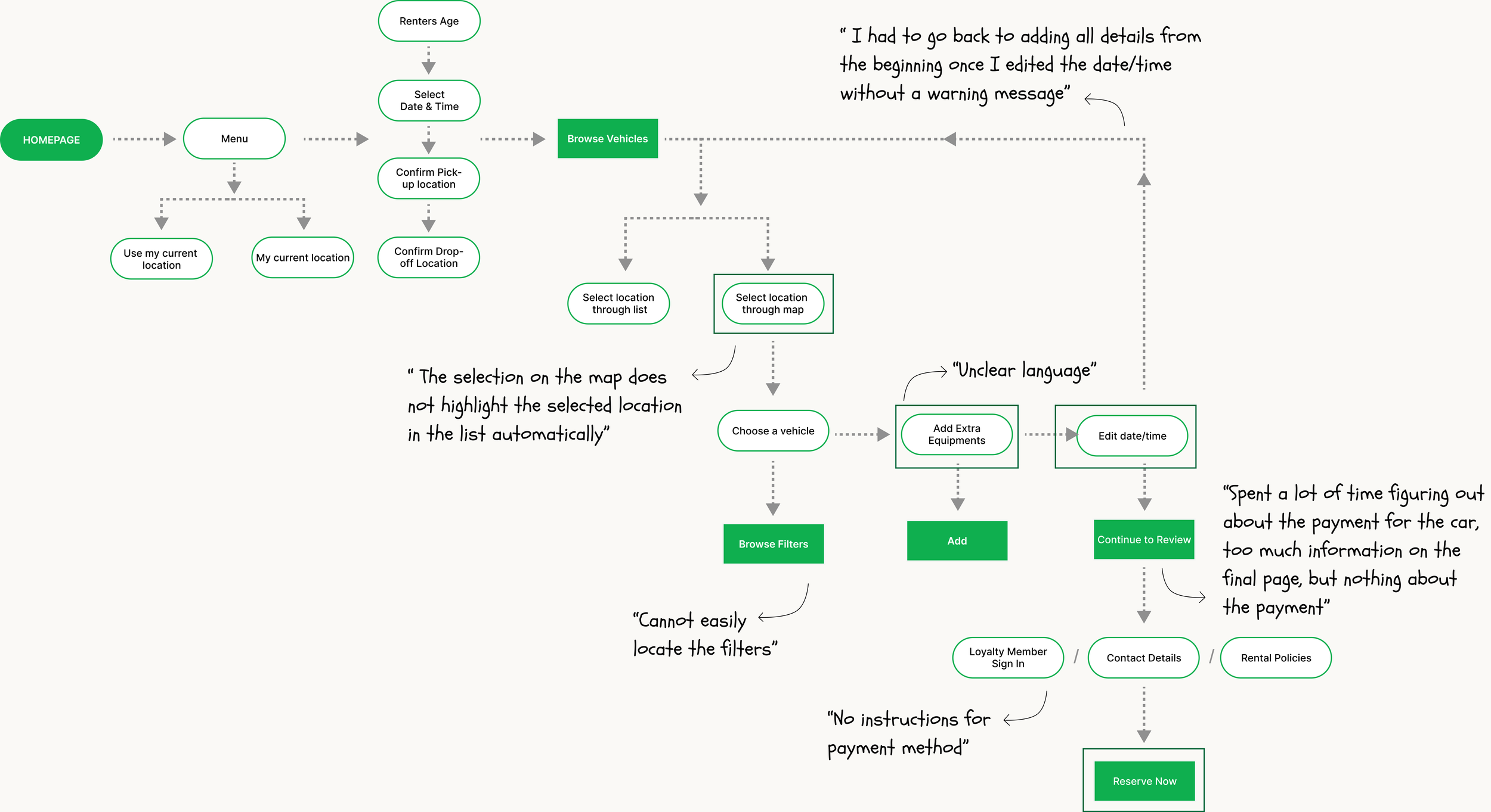
T A S K F L O W S + E V A L U A T I O NIdentify the exact pain points on Enterprise website during Sign up and Car Reservation user flows
It was crucial to perform the heuristic evaluation to find the exact area of issue in the user’s journey when signing up as a new user or car reservation. The goal of using heuristics was to identify the different factors that create friction in the process of making a confident online car reservation for short- or long-term trips. Furthermore, these findings would build the foundation of the project plan including conducting usability tests.
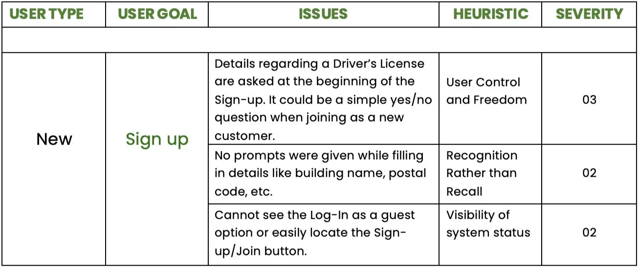
Sign up (as a new user) :

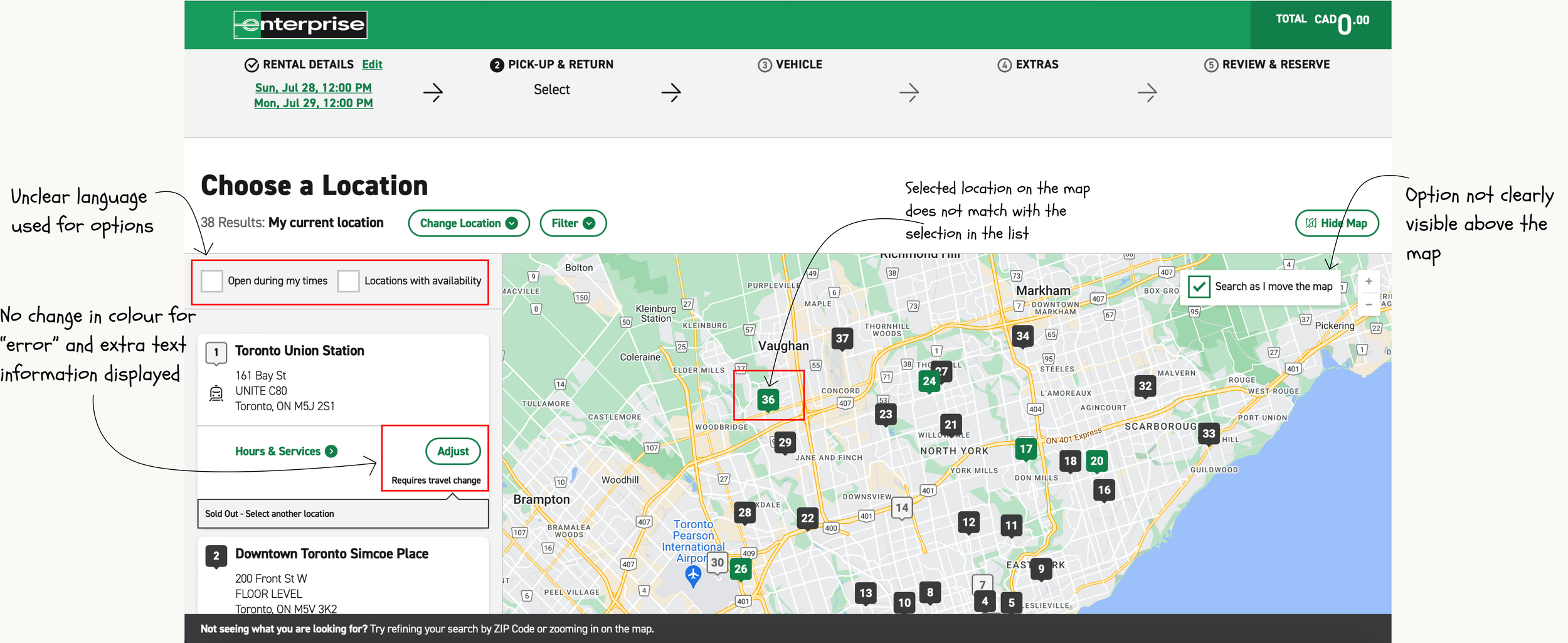
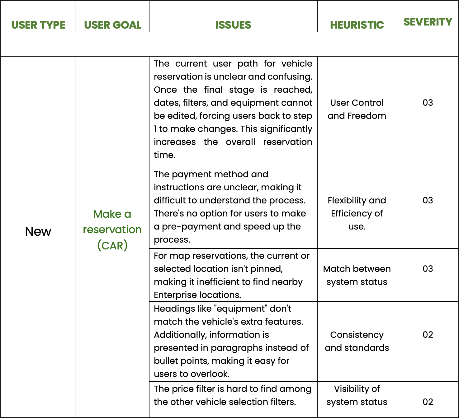
Make a car reservation (as a new or existing user) :
H E U R I S T I C E V A L U A T I O NEvaluation of website to find issues based on the 10 heuristics
The following are the heuristics used for analysis:
Visibility of system status | Match between system and real-world | User control and freedom | Consistency and standards | Error prevention | Recognition rather than recall | Flexibility and efficiency of use | Aesthetics and minimalistic design | Recognize, diagnose, and recover from errors | Help and documentation
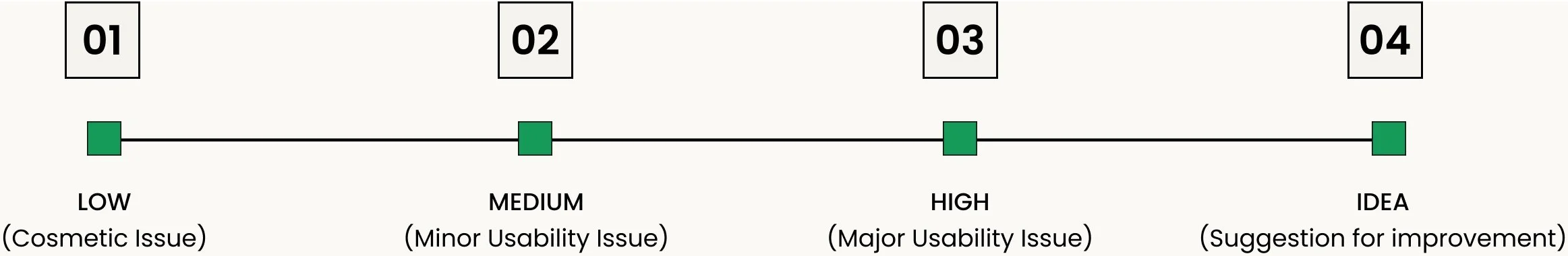
Severity scale used:
Sign up (as a new user) :
Make a car reservation (as a new or existing user) :
U S A B I L I T Y T E S T I N GUsability Testing Sessions with (12) participants -Understand issues faced during real time booking
12 Usability Sessions lasted between 30 and 45 minutes and included individuals from varying demographic backgrounds. All team members were present for the Usability testing sessions, which I moderated, recorded, and watched the participants for many sessions. We were able to validate and improve our conclusions from the heuristic evaluation with the aid of the insights obtained from the usability tests. These insights were intended to identify current problems and separate data for subsequent qualitative and quantitative research.

Participant table with comprehensive data
Some of the notes:
Notes: Participant 1
Notes: Participant 2
These are some of the notes captured from the Usability Testing. There were different symbols used for classifying the positive, negative, and Ah-Ha moments from different notes to be further used for Empathy Mapping.
E V A L U A T I O N Evaluating insights received from the usability testing sessions through Empathy Mapping
The insights collected from the different usability tests were then evaluated with the help of empathy mapping. The map was divided into four different categories sign-up, car reservations, behavioral observations, and general observations. This helped me sort all the different findings collected to focus on providing recommendations to improve the experience of the users making online car reservations.
Empathy Map for analysis:

M A I N I N S I G H T SFive major findings
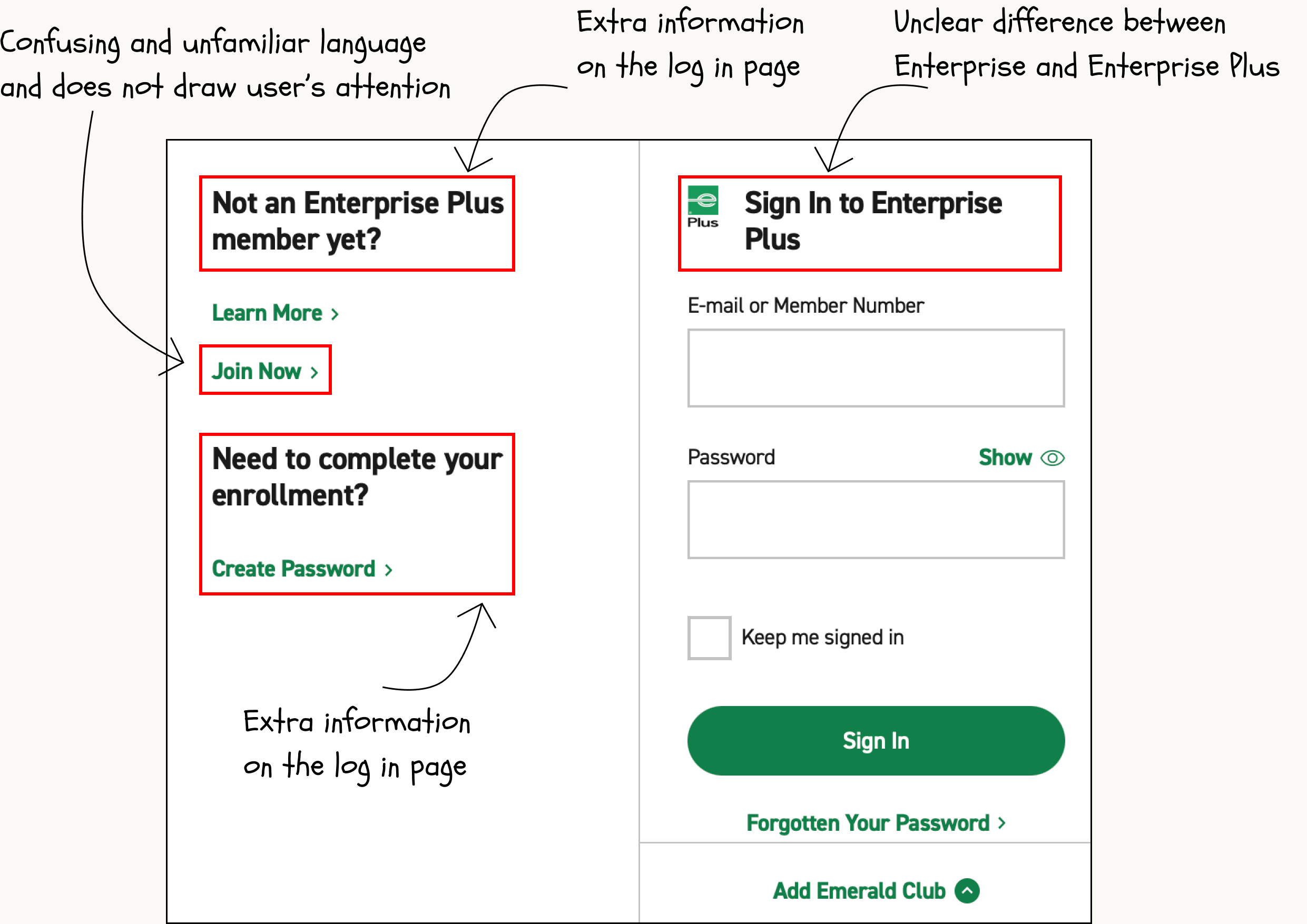
Almost all the participants were unable to locate or understand the “Join Now” button to set up a new account - Match between the system and real-world
Most of the users were frustrated upon repeating all the steps and re-entering the information in case they edited the date or time without a warning message - Help users recognize, diagnose, and recover from errors
The language used at different steps was not of common knowledge and was difficult to understand - Match between the system and real-world
The filter option is not placed properly on the website and is scattered, thus, participants missed out on important filter options to make their car selection process more customizable. - Aesthetic & Minimalistic Design
The payment option and instructions are unclear and participants spent a large amount of time figuring out the payment method. - Recognition rather than recall

Match between the system & real world
Help users recognize, recover from errors
Recognition rather than recall
Aesthetic and MinimalisticR E C O M M E N D A T I O N SRecommendations for the major insights collected to improve the experience of the users making online car reservations
Instead of using "Join Now," use "Sign Up," which is more straightforward for users to understand. Additionally, ensure the "Sign Up" option is placed prominently to make it easily visible and avoid it being overlooked.
Simplify the language throughout the website to make it more accessible and understandable for users. For complex terms, include suggestions or icons with explanations.
Clearly state the payment details/options and policies, and make this information easily accessible to users to prevent any confusion.
Replace the extra options and unfamiliar terms with a clear, structured layout and commonly used language to prevent user confusion.
C O N C L U S I O N + L E S S O N S L E A R N T What I’d do differently next time.
A Super exciting research project 🎊
The usability testing sessions for the Enterprise Rent-A-Car website revealed several key issues that need addressing, such as difficult navigation, unclear language, and cluttered payment screens. By fixing these problems, the website can become more user-friendly, saving users time and increase car reservations by 30%
Scheduling and the Art of Usability Testing: Coordinating usability tests with users can be tricky due to differing schedules. Being flexible is the key. The usability test sessions were both exciting and overwhelming for me as a researcher. Usability test sessions along with the heuristic evaluations covered different aspects of the website for the analysis.
Feedback Analysis/Recommendations: It’s crucial to carefully analyze the user feedback after the usability testing sessions and find suitable recommendations for the same. After the sessions, I relied on empathy mapping to divide the various insights received and focus on providing recommendations for the negative findings. Towards the end of the project, I provided design recommendations for all the main negative findings found from the test sessions.
Design Screens: If there was something I’d do differently, then it would be an opportunity to do Enterprise, Rent-A-Car project as an end to end project. I’d also like to cover the design part of the project where I can design screens for the website based on the user feedback and insights. This will help me to transform the user insights on to the web screens efficiently.
Thank you for reading!

More Projects:
Research Project - Airbnb (Introducing a new tool)
Design Project - Humber Events Website