|
|
Introducing a new comparison tool for Airbnb
Simplifying property comparison for Airbnb users

January - April 2024
(14 weeks)
Timeline
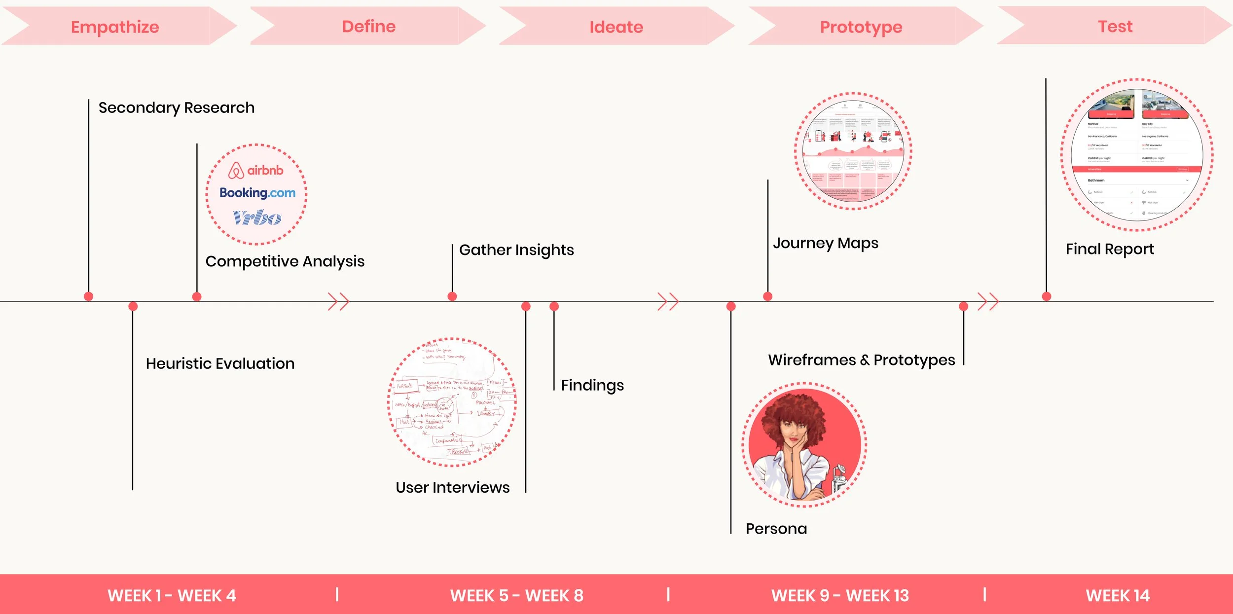
User Research: Competitive Analysis, Screener, Project Plan, Interviews, Card Sorting, Persona, Journey Mapping, Task Flow
UX Design: Sketches, Low fi- Mid fi Wireframes, High fi Wireframes, Prototypes
My Role
Figma
Miro
Adobe Illustrator
Toolkit
View and compare multiple properties on a single screen
Flexibility to compare selected features of the properties
Reduce memory load on the users
Make bookings more confidently
C O N T E X TSimplify property comparison for Airbnb users
B A C K S T O R Y   &
P R O B L E M     S T A T E M E N T
What if there was a feature within Airbnb to compare multiple properties side by side, that would make the selection process easier without needing to depend on screenshots and prints
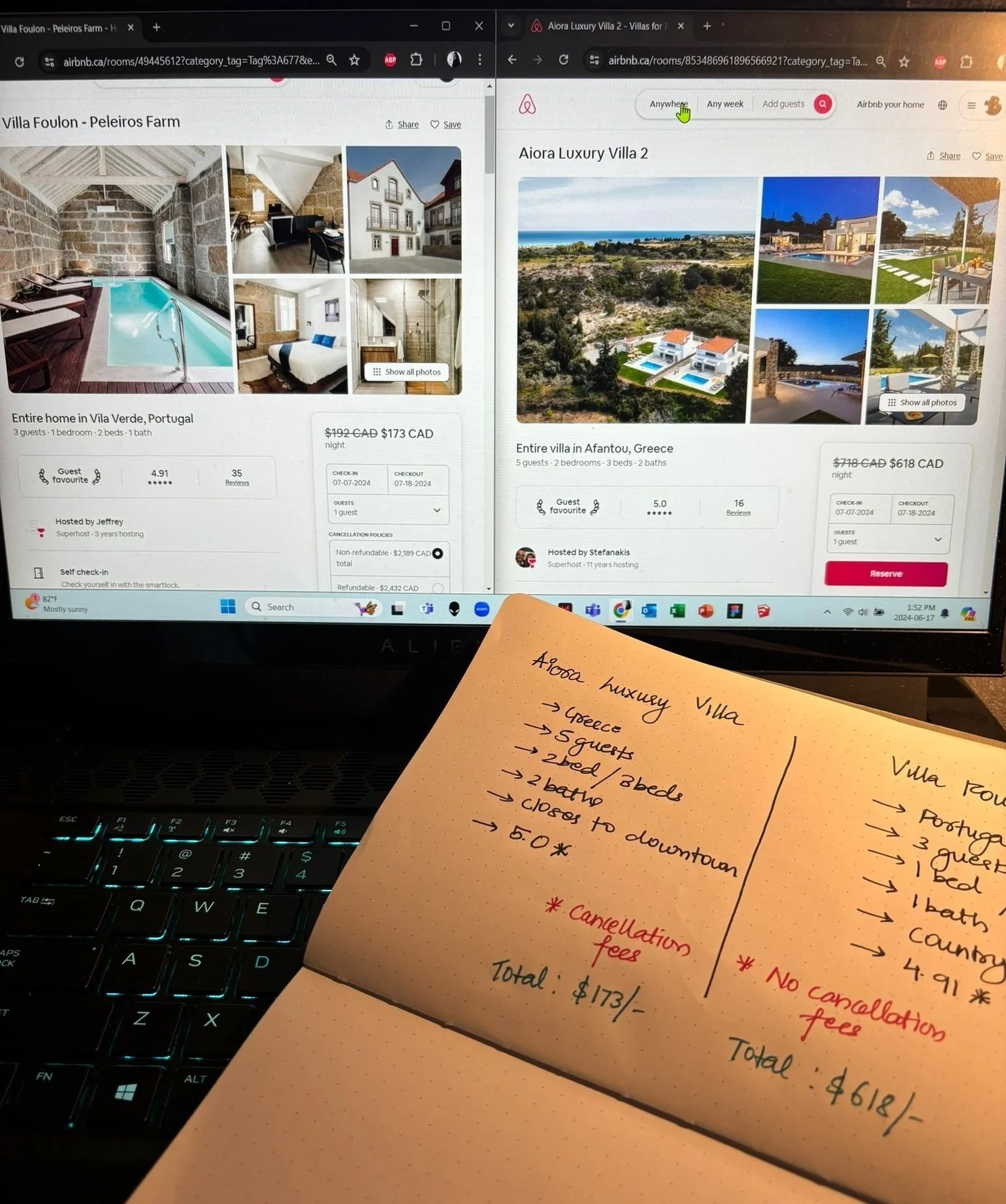

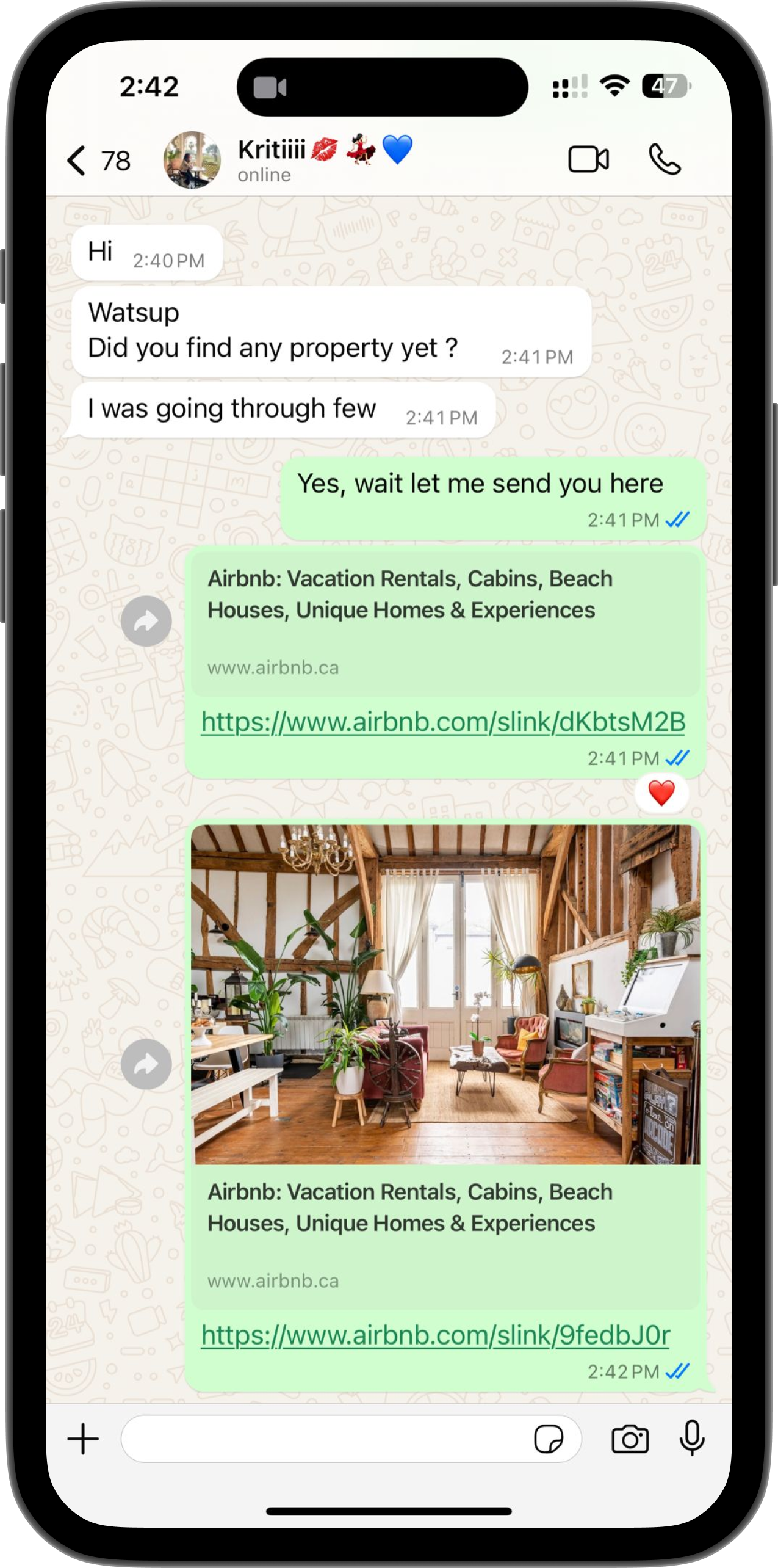
As someone who loves exploring new places and unique stays on Airbnb, I often get overwhelmed by all the options. Taking screenshots, sharing links, & comparing prints can get frustrating & confusing to remember.

T H E S O L U T I O NCreative new comparison tool to decrease browsing time and increase property selection efficiency
Highlighted properties for comparison.
Automatically highlight the count of properties when selected for comparison.
Can choose more than two properties to compare without having to remember the details.

Reduce Memory Load on users
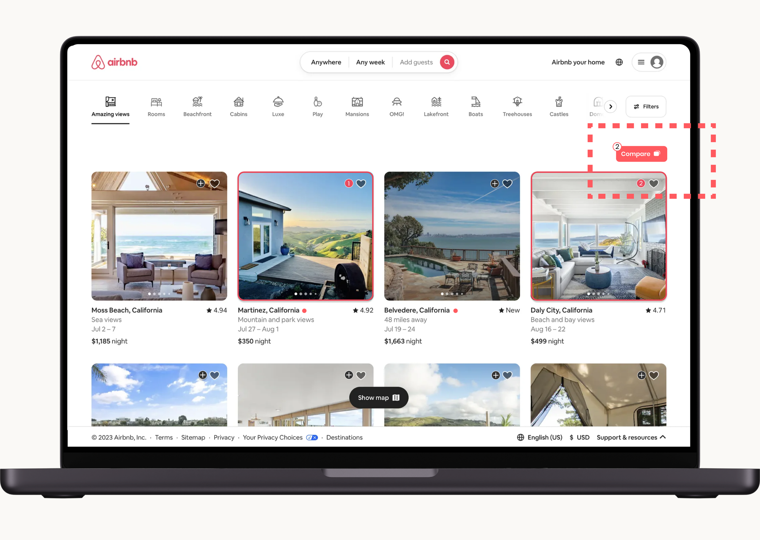

Increase user efficiency & reduce browsing time
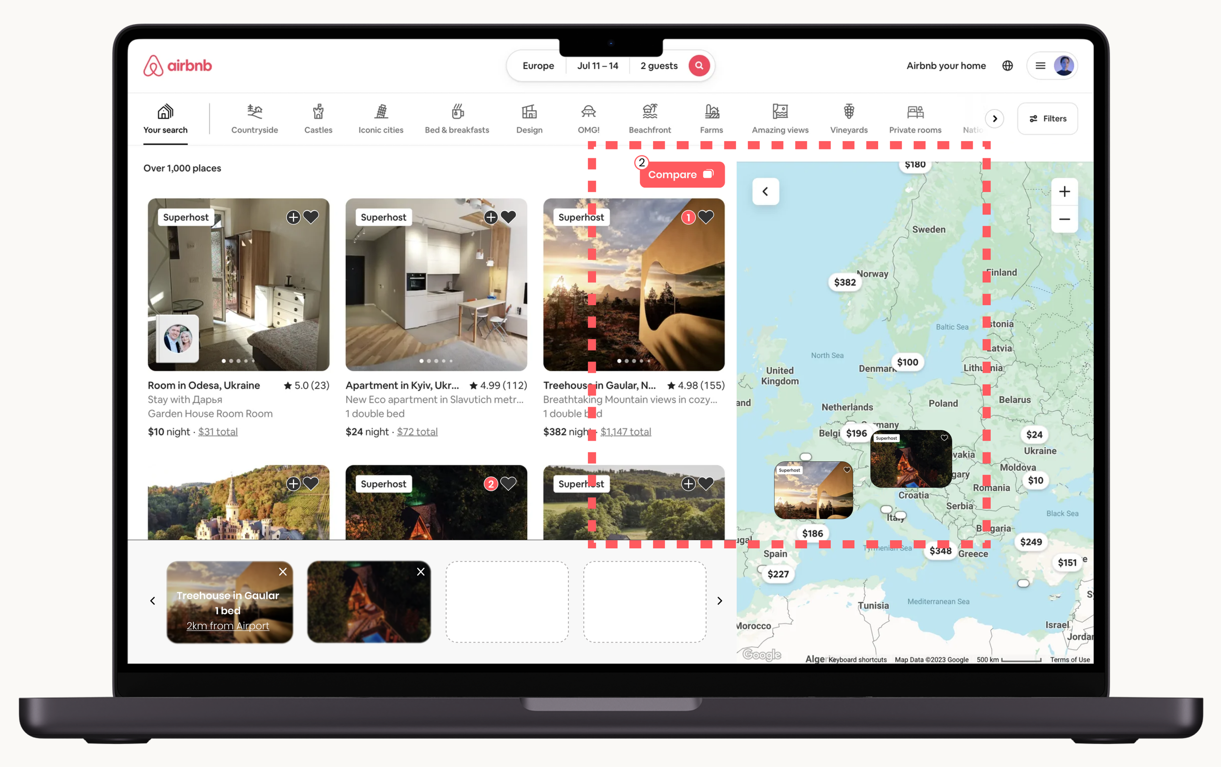
Intuitive filtering system to narrow down results faster.
Evaluate multiple properties side-by-side.
Monitor recently viewed and saved properties.


Increase flexibility & freedom to compare properties
Enable sharing comparison lists for collaborative decision making.
Compare different booking dates and prices for the same properties.
Interactive maps with property pins to visually compare locations and proximity.
Select specific filters for comparison.
D E S I G N P R O C E S S + T I M E L I N EIdentify area of improvements to make more confident bookings
The design process began with extensive primary, and secondary research, and user interviews to study how people around the world travel and use accommodations. This research helped uncover users’ needs and expectations from Airbnb. I analyzed pain points and requirements to craft a persona and journey map based on the insights gained. This research helped identify stages where a comparison tool could streamline property decision-making for users.
C O M P E T I T I V E A N A L Y S I SEach of the competitors had something unique to offer but….
I analyzed both competitors with Airbnb and found that almost none had a side-to-side comparison tool for booking properties of interest. This lack of advanced comparison features significantly increases users’ browsing time and extends the overall purchase path.
“We want to be distinct, memorable, and timeless”
“Respect, Community, and Integrity”
“Focus on community, authenticity, and inclusivity”

R E S E A R C H + U S E R I N T E R V I E W SUnderstanding the user
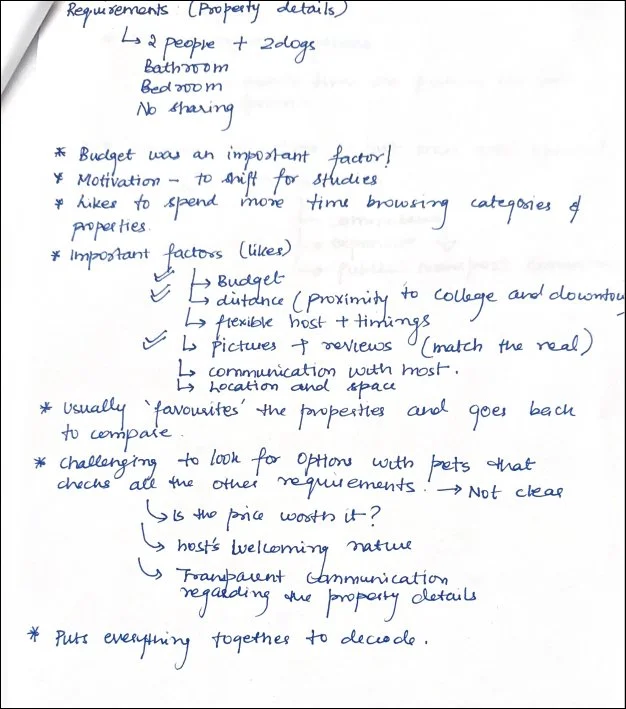
To understand the “why” behind the problem, I conducted ten 45 min to 60 min interviews with students between the ages of 24-30 who have previously booked properties online. I wanted to understand their experience during the booking process and explore how they currently decide between multiple property options.
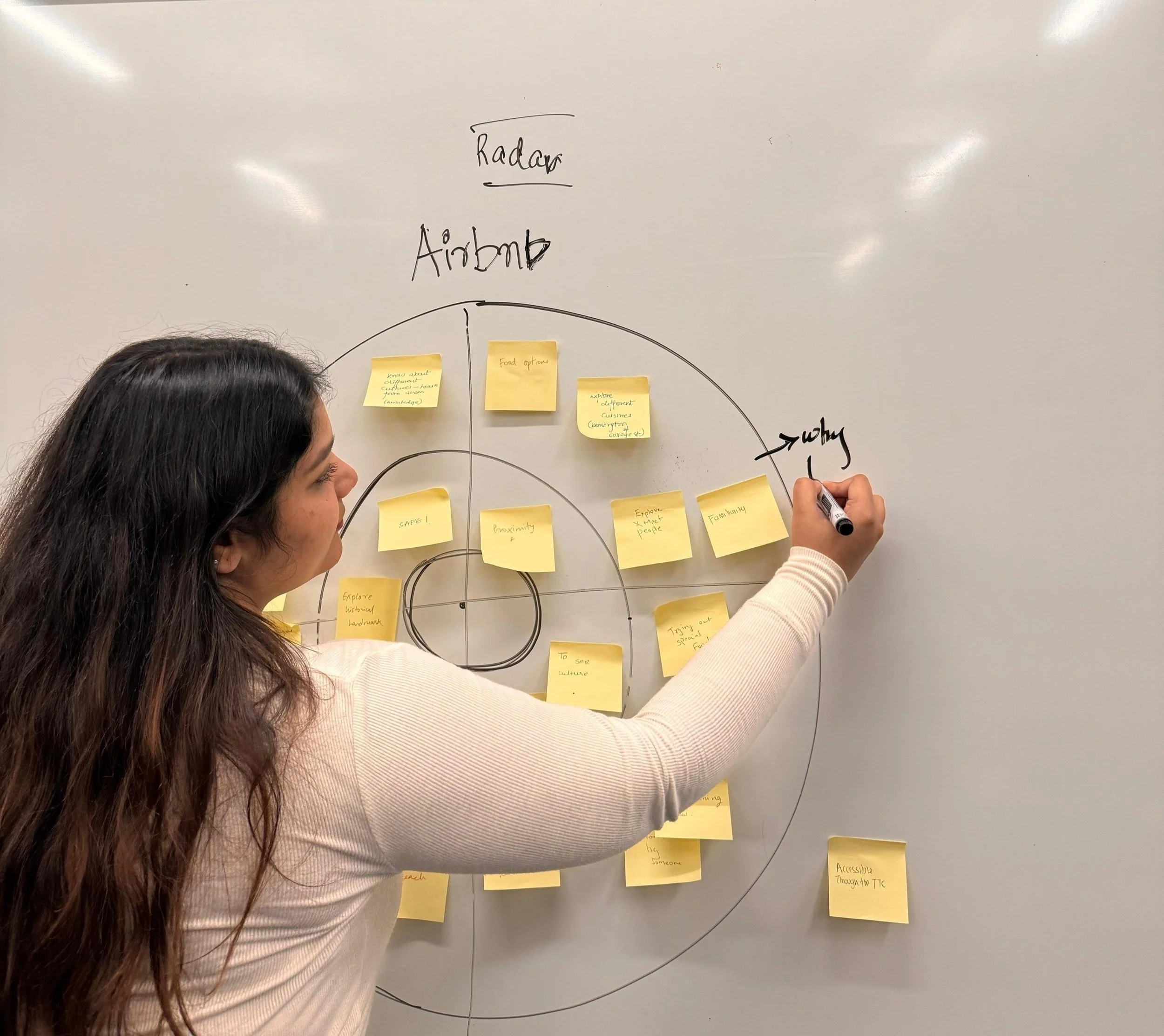
After completing the interviews, I combed through the interview notes, classified quotes as pain points, motivations, or behaviors, and used empathy mapping, and Radar method to extract five major themes and insights.

Can you tell me about your most memorable trip yet?
Walk me through your process of booking a property on Airbnb and draw out the steps highlighting your journey.
Walk me through one of your experiences, where you used a comparison tool to compare different accommodations on any online platforms.
Interview Questions:
Notes - Participant
Notes - Participant
Tell me about a time when you planned a trip, how you finalized a property and did you use any tools, or methods to organize your information.
Can you give examples of property features or details that are important to you for finalizing a property?
What are the different aspects that boost your confidence and give reassurance that you have made the right selection of property for your stay?
Link for the Interviews here.
O B S E R V A T I O N SThree major findings
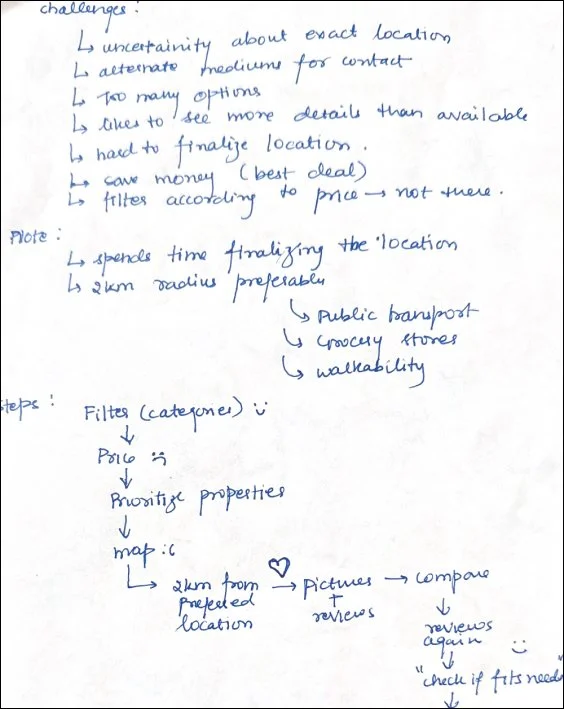
Users cannot currently view and compare multiple locations efficiently, hindering their decision-making process and ease of choice.
Users have to manually adjust filters or click on each listing individually to access additional details.
Users struggle to remember and compare details, especially since they can’t easily combine categories when searching for options.
Radar Technique for analysisCompare multiple locationsManually adjust filters


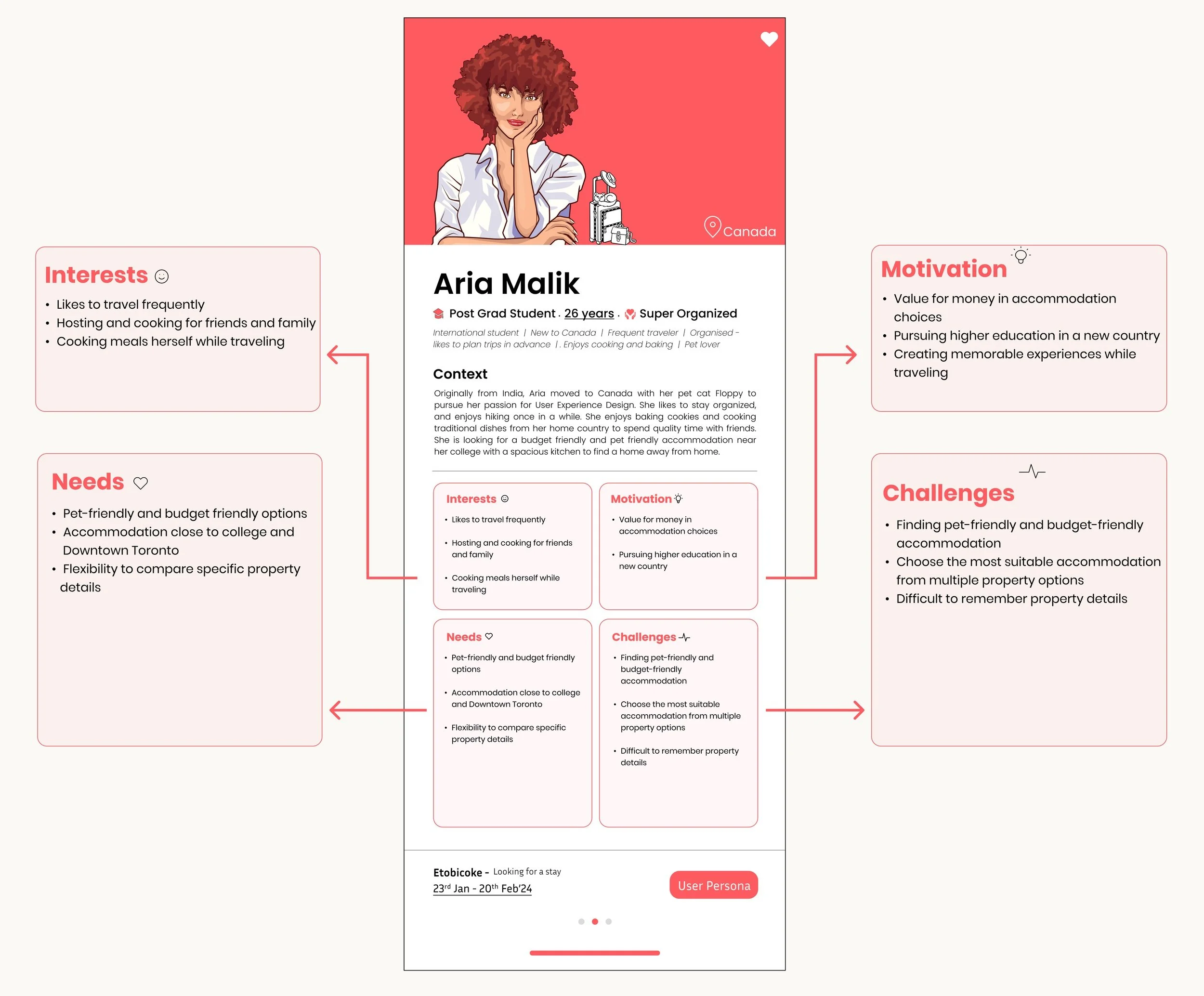
Struggle to compare detailsU S E R P E R S O N AAn International Student looking for a pet friendly accommodation, nervous to book the right property
Requirements:


Proximity to college
Budget friendly


Pet-friendly
Confident Booking
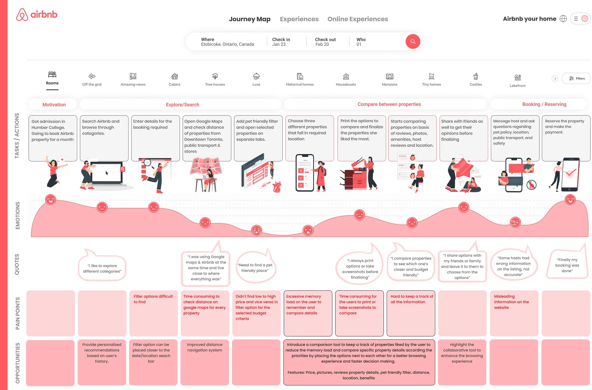
J O U R N E Y M A PDeveloped a journey map to understand end-to-end experience of making an Airbnb reservation online
By putting myself in the users shoes, I was able to identify moments of opportunity where a comparison tool would help users decide amongst multiple property options efficiently.
Pain Points:


Take printouts to compare properties
Excessive memory load on users
Hard to keep a track of all the information
Take screenshots to compare properties
T H E M A I N I N S I G H T SFive major insights
Automatically highlights selected properties for easy comparison without the need to remember details
Shareable comparison lists enable group decision-making for bookings and vacations
Intuitive filters streamline result narrowing, speeding up the evaluation of multiple properties side-by-side
Compare booking dates, prices, and property details to make informed choices
Interactive maps with property pins provide a visual overview of locations, aiding in understanding proximity and surroundings

“As an international student in a new country, I want to compare properties to see which ones are closer to college and budget-friendly”
With the help of user stories and user experiences about making online reservations, I created a primary task flow that provides the flexibility to compare multiple properties based on specific property details selected by filtering.
U S E R F L O WPrimary task flow
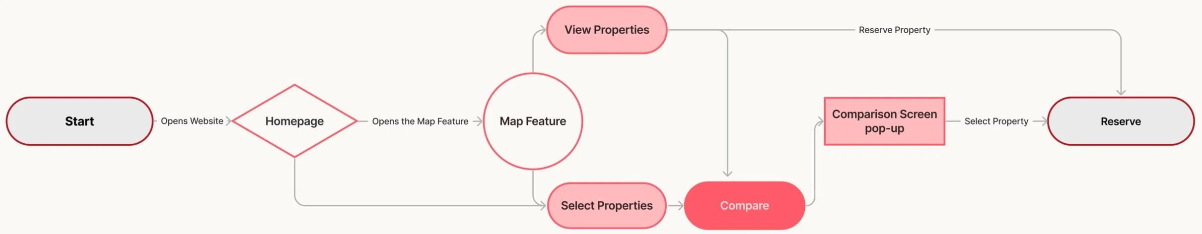
Legend:

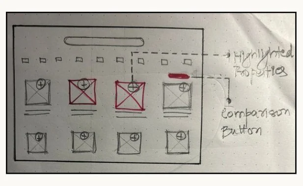
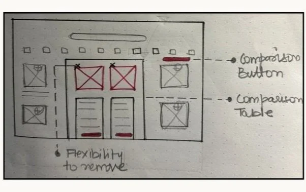
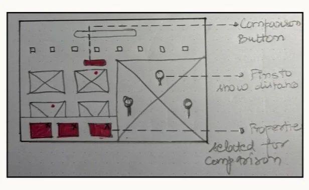
D E S I G N S K E T C H E SBrainstorming design solutions
A clear user flow with flexibility to compare properties at different stages of online reservation helped me sketch out the possible design solutions. With inspiration from other existing UI components, I started sketching ideas that were translated to wireframes.
Goal: New property comparison tool that seamlessly integerates into the existing app. designed to be intuitive & empower users to make decisions effortlessly.
Homepage with selected properties and comparison table
Method - 01
List of highlighted properties with map feature
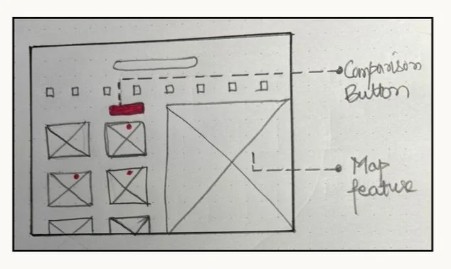
Method - 02
Based on the insights from interviews and feedback collected from ten International college students studying in Humber college, I researched and continually iterated my design over the span of 14 weeks - with 2 major additions and improvements.
F I N A L D E S I G N2 major additions & improvements in my design

Evaluate multiple properties
side-by-side
“ I always print properties or take screenshots ”

Interactive map with pins
to compare them together
“ I compare properties to see which one’s closer and budget-friendly “
L E S S O N S L E A R N T What I’ve learned and do differently next time:
Airbnb was my first-ever UX Project! 🎊I’m extremely grateful for the opportunity to go through an entire UX process to better understand all the steps involved. On that note, here are a few of my learnings:
Stronger attention to insights to frame my story: Weeks of research and development at a point resulted in unnecessary information and diversion from the insights collected. At that point, it was important to cut down on the extra information and focus on collected insights directed towards the problem identified. This helped me answer some bigger questions like - “How does this fit into the bigger picture” and “What impact does it have on increasing the client engagement and enhancing their experience”? Hence, going forward focusing better on the insights will help improve my storytelling abilities.
Focus on WCAG and brand guidelines: After identifying the issue, I explored various options to provide multiple ways and flexibility for users to compare properties better, however, blending those ideas into the existing brand guidelines was a challenge. Not only the brand guidelines but I’ve got a better sense of how to follow WCAG standards better next time.
Trust the process, it’ll get you there: Since it was my first UX project, it was crucial for me to thoroughly understand the significance of each step from start till end. I believe every step has contributed in gaining substantial evidence and detail to trust the identified problem and proposed solution. At the end, each project may follow a unique approach and process, but its crucial for every step to add value to the overall research.
Thank you for reading!

More Projects:
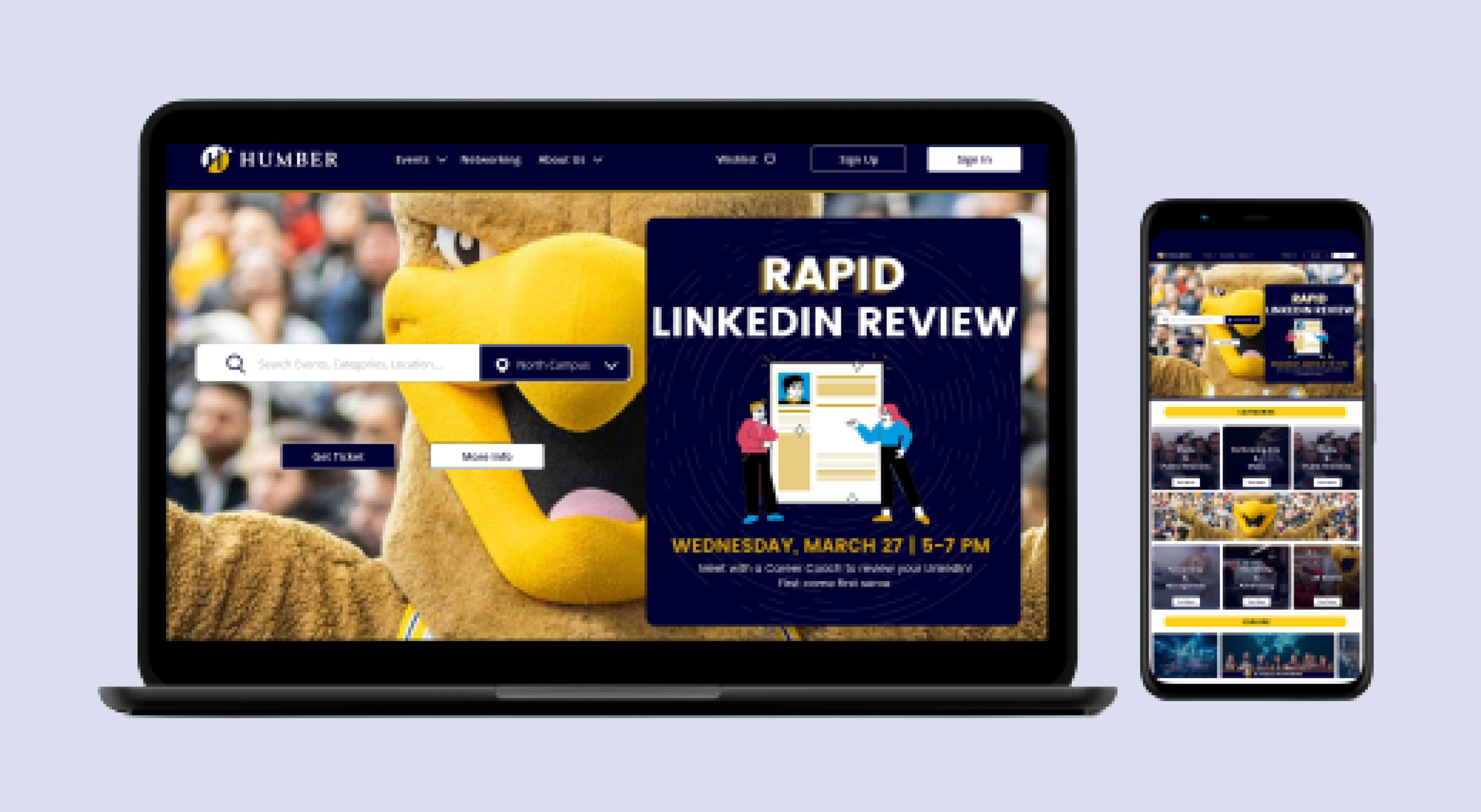
Design Project - Humber Events Website

Research Project - Enterprise Rent-A-Car